 Posts
Posts


I have been using both two-dimensional and three-dimensional applications for more than fifteen years, and enjoy the different challenges I face when designing in each of these environments. I do not favor any environment over the other, nor do I think anyone should use or replace 2D applications with 3D applications, or vice versa. However, I think designers should learn to use both, blend and combine both 2D and 3D factors in their work, if possible or needed. Both technologies are important & useful to learn more about.
I believe that the demand for 3D designers will increase over time in many fields, such as entertainment, architecture, engineering, packaging, etc. The demand from customers to see things in a more realistic way with better real life accuracy, makes 3D applications at the top of the must learn list. In other words, customers want to see more characteristics, depth, and value in the final outcome/product.
3D and 2D technologies are different in numerous ways. The interfaces, tools, and environments vary. Moreover, the method in which you select, modify, create, import, and export are different too. The first time you launch a 3D application, like 3DS Max, you will find it to be both intimidating and complex. It is a challenge at the beginning, but like anything else, a little bit of practice is all you need. It doesn't matter which 3D application you use, and does not matter how much the 3D technology is changing, the concept of 3D modeling never changes. Learning 3D modeling is fun, and once you get a hold of it, the possibilities are without limits.
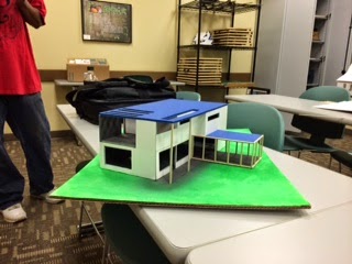
Below are some of my ITT student’s works: creating a physical model based on a 3D model created in 3DS max.

Designed by Codi Andexler

Designed by Cory Holliday

Designed by Brad Porter

Designed by Frank Spoljaric
I believe that the demand for 3D designers will increase over time in many fields, such as entertainment, architecture, engineering, packaging, etc. The demand from customers to see things in a more realistic way with better real life accuracy, makes 3D applications at the top of the must learn list. In other words, customers want to see more characteristics, depth, and value in the final outcome/product.
3D and 2D technologies are different in numerous ways. The interfaces, tools, and environments vary. Moreover, the method in which you select, modify, create, import, and export are different too. The first time you launch a 3D application, like 3DS Max, you will find it to be both intimidating and complex. It is a challenge at the beginning, but like anything else, a little bit of practice is all you need. It doesn't matter which 3D application you use, and does not matter how much the 3D technology is changing, the concept of 3D modeling never changes. Learning 3D modeling is fun, and once you get a hold of it, the possibilities are without limits.
Below are some of my ITT student’s works: creating a physical model based on a 3D model created in 3DS max.

Designed by Codi Andexler

Designed by Cory Holliday

Designed by Brad Porter

Designed by Frank Spoljaric

Designed by Adrienne Lofton


Designed by Amanda Jandes

Designed by Deandre Chandler

Designed by Fatima Ford

Designed by Jason Rodgers

Designed by Lester Evans
Designed by Matthew Bochnik

Designed by Thomas Shirley
